Click here to read the Spanish version.
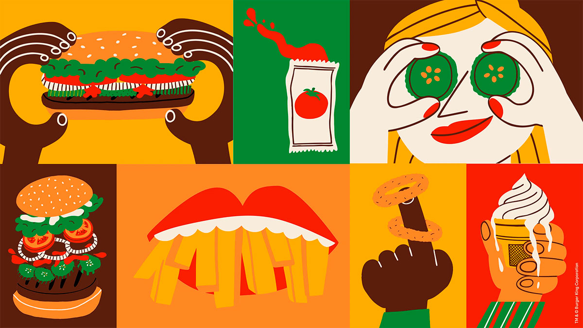
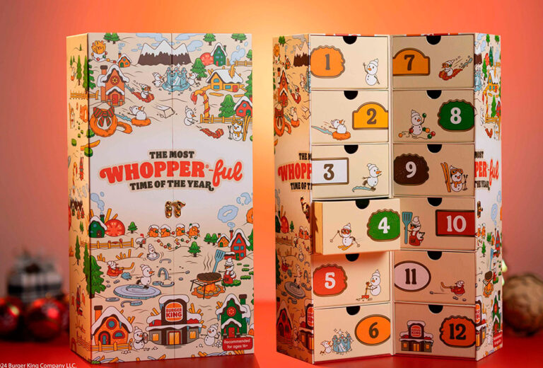
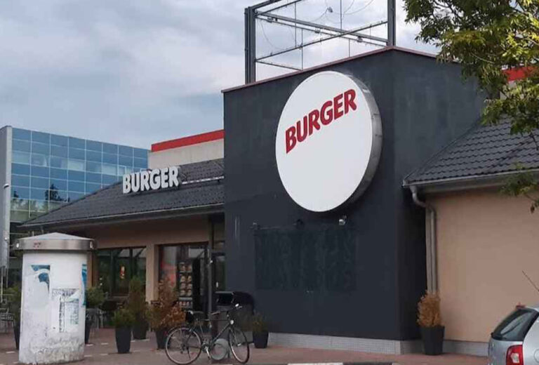
Burger King’s latest strategy is the ‘reclaim the flame‘ business plan, with which the chain aims to revitalise consumer desire. This will include the redesign of several basic and representative elements of the chain, such as its logo, its packaging and even its restaurants.
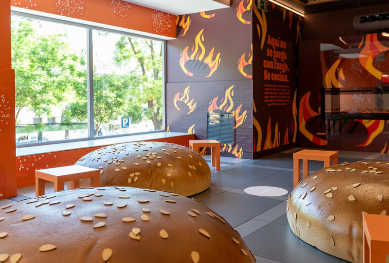
In this sense, the latest creative twist for its outlets will focus on giving visibility to the iconic Whopper with prototypes that are being built in Las Vegas and New Jersey, under the name ‘Sizzle‘.
As Burger King president Tom Curtis told CNN, the chain’s 2022 ad, with a jingle repeating the word ‘Whopper’, was just the beginning of a $400 million marketing plan to revitalise its image, with its flagship burger at the forefront.
What will be new in ‘Sizzle’?
The new Sizzle-style outlets will feature digital ordering kiosks, while their drive-thru will contain a simplified pick-up system, as well as a three-lane ordering option to alleviate traffic congestion.
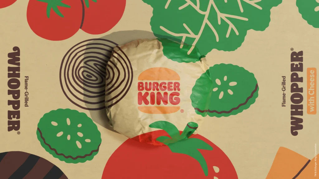
In addition, its new interior design project will serve up a vibrant variety of decorative elements that will put the spotlight on the Whopper in line with its refresh plan. One of which BK aims to have renovated 50% of its outlets by the end of 2024.

