Click here to read the Spanish version.
Lyle’s Golden Syrup, the best-known brand of 19th century British golden and/or sweet syrup in history, has survived the passage of time to become an essential product in international cuisine. Above all, as a much-loved baking ingredient in the UK.
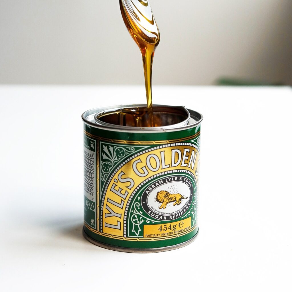
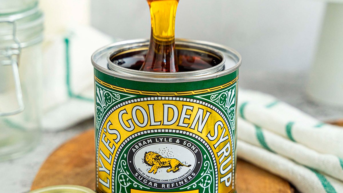
The representative packaging of ‘Golden Syrup‘ since its creation in 1883 had consisted of a Victorian-style metal tin can sealed with a logo of a dead lion surrounded by bees. A design that has continued to this day, with a whole history and religious background behind it.

Lyle was a religious man, according to the Lyle’s Golden Syrup website, and the image comes from the Old Testament story of Samson and the lion. In the Bible, Samson kills a lion and when he later sees the carcass, it is full of bees that have made honey on it. In fact, part of the verse, “out of the strong came forth sweetness”, is included in the 1883 logo.
The can was awarded the Guinness World Record for the oldest unchanged branded packaging in 2007, which remained unchanged until now.

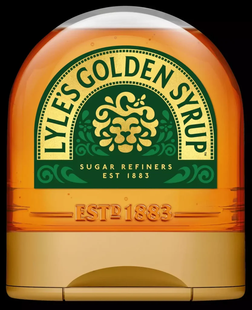
The new packaging design is inspired by aesthetic minimalism, featuring a much simpler logo than the original with a golden lion’s head that updates the packaging, which will be released this month in different formats.


